A heading over a slide or photo
Use transparent PNG when the destination accepts images. Export at the size you need; enlarging a small PNG cannot recover missing detail.
Make a transparent PNG →From a few words to a finished layout
Choose a download for the app and size you will use. This guide explains which exports keep a transparent background, scale cleanly, retain selectable words or allow later edits.
By FontStyleLab · Examples made with our free text tools
The file extension alone does not tell you whether lettering is an image, a vector shape or selectable text. Choose the export workflow that matches what you need to do next.
Use transparent PNG when the destination accepts images. Export at the size you need; enlarging a small PNG cannot recover missing detail.
Make a transparent PNG →Use Text to SVG to create lettering that scales cleanly in a compatible app. This is a separate editor; it will not reproduce every effect from the text generator. If you need a PNG, use the print-size check in the poster section.
Create outlined SVG →Use Text to PDF for a text document. Pasting a lettering image into a PDF does not create searchable words. Keep the original text for revisions.
Create a searchable PDF →Type the words in the destination document and use a font available there. PNG and outlined SVG preserve appearance, not editable wording. Save your FontStyleLab project separately when that option is offered.
| Export and tool | Transparency | Scaling | Selectable text | Editing | Printing |
|---|---|---|---|---|---|
| PNG · Text generator | Choose Transparent PNG to omit the background. | Fixed pixels. Enlarging the image reduces detail per inch. | No text layer; the words are pixels. | Edit as an image. Change the wording in the generator. | Match the exported pixel dimensions to the size you will print. |
| SVG · Text to SVG | Transparent or white, according to the tool setting. | Vector letter outlines remain sharp when enlarged. | No text layer; letters are paths. | Edit paths in a compatible vector app. Recreate the words in Text to SVG to change the wording. | Print from an app that supports SVG; check the placed dimensions. |
| PDF · Text generator / Compare fonts | A page layout; use PNG or SVG for overlays. | The lettering is raster. A PDF container does not make it vector. | The design samples are images. Comparison labels may be selectable. | Regenerate the design or samples to change the lettering. | The generator puts one design on each page; comparison arranges labeled samples on sheets. Higher resolution adds detail, not page size. |
| PDF · Printable letters | White paper layout. | Vector outlines remain sharp when scaled. | No selectable lettering; letters are paths. | Change wording and sizing in the letter editor. | One character per page. Use matching paper and Actual size / 100%. Check one letter before the full batch. |
| PDF · Text to PDF | A document page, not an overlay. | Embedded font text scales without rasterizing the letters. | Yes, for supported text. No OCR is needed. | Keep the source text for revisions. Editing an existing PDF depends on the receiving app. | Choose paper that matches the PDF page size and check the print preview. |
An exported file is not an editable FontStyleLab project. Where Save project is available, save a project and backup separately. Outlined lettering does not retain the original text; searchable PDF does not automatically mean an accessible, tagged PDF.
For help with missing characters in a document, see Fonts supported by Text to PDF.
On a phone, Fonts changes the typeface, Style contains text styling, and Canvas contains Fit to text. Download buttons appear below the selected preview.
Pick a font that is readable at the size people will actually see. A decorative face can work for a short title; a simpler one is usually easier to scan in a longer line. Check punctuation and accented characters before downloading.
Still choosing a typeface? Use font comparison for compact samples of the same sentence and a labeled PDF handout with several fonts on each sheet.
For a slide heading, start with Lato Bold, as in the example below. If you want a more geometric feel, compare Lato with Roboto using your title. For a short decorative overlay, try Lobster, shown in the next section. Its connected lettering benefits from a little breathing room: check that the words stay distinct against your photo.
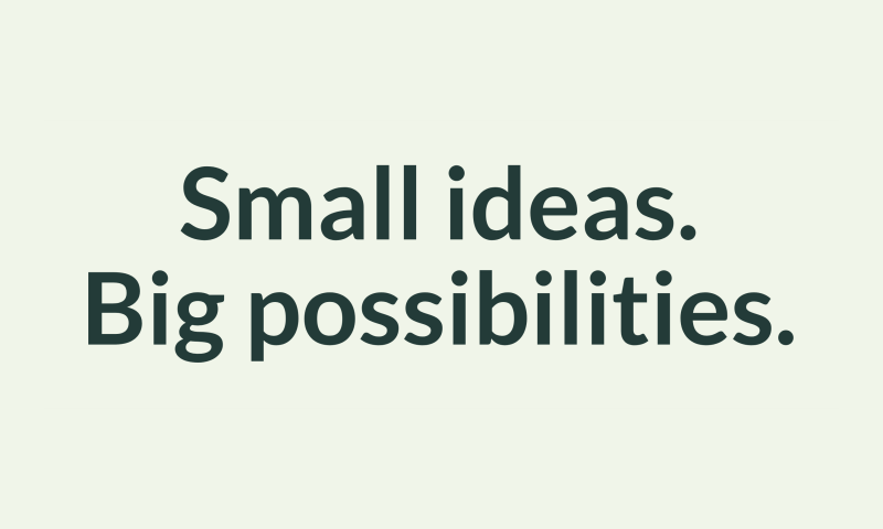
Download your chosen PNG, then use your presentation app’s image-insertion command. In PowerPoint for Windows, use Insert → Pictures → This Device; on Mac, choose Insert → Picture → Picture From File. Microsoft’s picture insertion guide covers the different versions.
Keep the image’s proportions when resizing. Position the heading, then check it in presentation view. For a photo overlay, choose a text color that remains readable over the part of the photo behind the words.

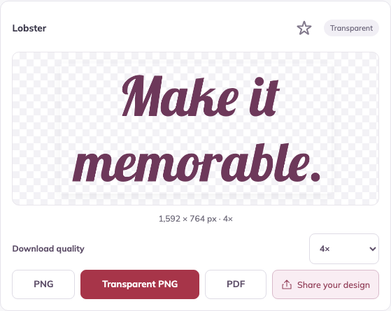
A PNG keeps the exported appearance without requiring the recipient to install the font. Its words are part of an image: return to FontStyleLab to change the wording, and add alternative text in your presentation when the image carries meaning.
Decide how large the graphic will appear before exporting. PNGs have a fixed number of pixels, so increasing their placement size reduces the available detail. Check the width and height shown below the preview; those dimensions include the padding.
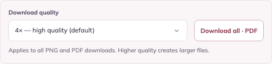
Increase Download quality, download a fresh PNG and compare its pixel width with your target. If the editor cannot produce enough pixels, use SVG where supported or place the image at a smaller size. Changing a resolution label or enlarging an existing PNG cannot restore detail.
For lettering you will enlarge, use SVG in an app that supports it. Microsoft documents SVG insertion and resizing in Microsoft 365.
For an arched label or circular badge, start in the curved-text generator and adjust the bend before exporting. Check the final layout at its intended size before sending it to print.
A decorative quote, cover graphic or event title can work well as a PNG in a document. Insert it as an image, preserve its proportions and check the page layout after placing it. A transparent background helps it blend with the page.
Keep body copy and structural headings as editable document text so readers can select, search and navigate them. When a graphic contains meaningful words, include them in its alternative text. Microsoft’s Word accessibility guide explains built-in heading styles and image descriptions.
For a proposal or report, use a graphic as a visual accent while keeping the essential information in the document itself. Check that the image still looks clear in the final PDF you share.
For a worksheet or lesson slide, create a short title in a readable font and insert it as a PNG. Leave instructions and exercises as normal text in the document so they stay easy to revise.
For wall displays and banners, the six styles of printable bulletin board letters include ready-made alphabet and number packs. Customize a heading to download one letter per page. The classroom printing guide covers physical sizing, paper selection and arranging your letters.
Choose the text generator for a printed design sheet, printable letters for one character per page, or Text to PDF for a searchable plain-text document. The comparison above explains how their PDF contents differ.
For a heading inside an existing slide or document, insert PNG or SVG where supported. Keep essential wording as native text when it needs to stay editable, searchable or accessible.
Looking for a photo, video clip, music or sound effects? See our Pond5 stock-media guide and first-order offer.
Creating something for a client or commercial project? Read Fonts & licences for font permissions and source information.
Was this guide useful?