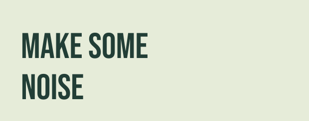
Tall & condensed
Bebas Neue
Narrow, upright capitals give a short headline height without taking over the width. A useful starting point for event names and stacked titles.
Choose Bebas Neue over Anton when you want a lighter, more open headline.
The font edit
A few words. A big impression. Find the voice for your next gig poster, school fair or bold announcement.
Eight picks. Real previews. Ready to make your own.
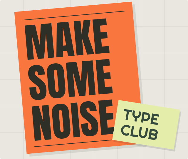
Follow a font name to see its specimen and a more detailed recommendation.
Swipe or scroll sideways to see all columns.
| Font | A good starting point for | Keep in mind |
|---|---|---|
| Bebas NeueTall & condensed | Stacked event names and narrow spaces. | Keep supporting details in a simpler, less condensed font. |
| AntonHeavy & direct | Short announcements that need a strong focal point. | Long titles can feel dense; shorten the wording or add a line break. |
| Barlow CondensedNarrow & understated | Longer headings with a lighter visual rhythm. | Regular is relatively light. Check it carefully at the intended viewing distance. |
| Lilita OneSoft & chunky | Friendly school, party and community titles. | Its rounded personality can be too playful for a formal announcement. |
| Abril FatfaceDramatic & elegant | Large exhibition, literary and fashion headlines. | Fine strokes need space and contrast; avoid small supporting text. |
| RighteousGeometric & retro | Retro events with a distinctive title. | Unusual letter shapes draw attention. Keep decoration around them restrained. |
| Russo OneSquare & sturdy | Sports, gaming and technology event names. | Broad letters use more width; plan for a short title or two lines. |
| Fugaz OneSlanted & energetic | Active, upbeat messages with a sense of motion. | The Regular style already leans forward; extra italic styling is unnecessary. |
Same words, same type size. Regular styles throughout.
Tall & condensed
Narrow, upright capitals give a short headline height without taking over the width. A useful starting point for event names and stacked titles.
Choose Bebas Neue over Anton when you want a lighter, more open headline.
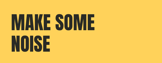
Heavy & direct
Thick strokes and compact shapes make a few words feel emphatic. Try it for a sale, a gig or a poster with one clear call to action.
Keep the message short. Anton has more visual weight than Bebas Neue, so give it room.
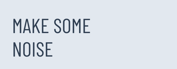
Narrow & understated
Slim proportions and slightly rounded details give a longer heading a quieter rhythm. The Regular style leaves more breathing room than the heavier picks here.
Try it when a title needs more words. Check a print at the intended size before using this lighter style at a distance.
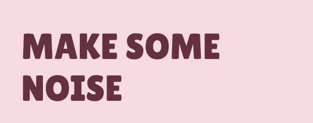
Soft & chunky
Rounded corners and plump letters make a bold heading feel friendly. A cheerful option for a school fair, a party or a playful announcement.
Choose Lilita One over Anton when the message should feel welcoming rather than urgent.
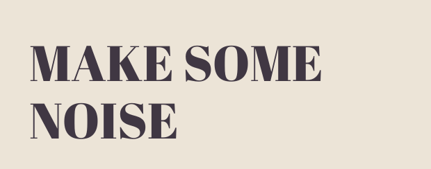
Dramatic & elegant
Thick strokes meet fine serifs for a strong contrast inspired by nineteenth-century display lettering. Try it for an exhibition, a literary event or a fashion-led poster.
Use it large enough to keep the fine details visible. For small supporting text, switch to a simpler font.
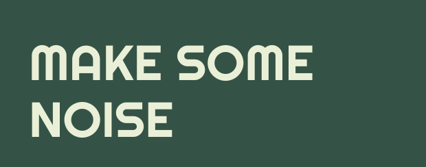
Geometric & retro
Circular forms and distinctive joins bring a playful, Deco-inspired character. It works as a starting point for music nights and retro-themed events.
Keep the surrounding layout simple so the unusual letter shapes can carry the personality.
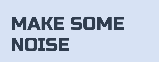
Square & sturdy
Broad, squared shapes give a title a solid, engineered feel. Try it for a sports day, a gaming event or a technology showcase.
It takes more horizontal space than Bebas Neue. Break a longer title into two lines instead of squeezing the letters.
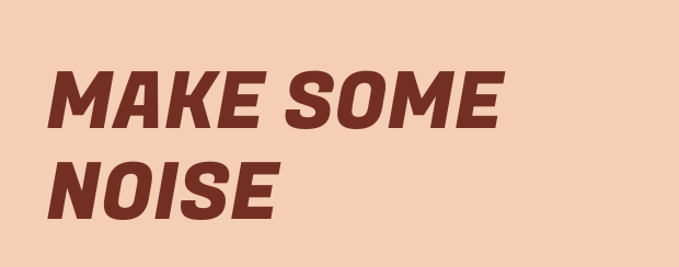
Slanted & energetic
A built-in forward lean and curved strokes give words a sense of movement. Try it for an upbeat workshop, a race or a lively announcement.
This slant is part of the Regular design. Start with the normal style in the tool before adding any effects.
Previews use the bundled Regular font files. The generator opens the same words, font and colors; its Google Fonts version may differ slightly. You can change the wording, layout and colors there.
These fictional event posters show a heading font alongside a quieter font for the details. Notice what you read first, then how you find the date, time and place.
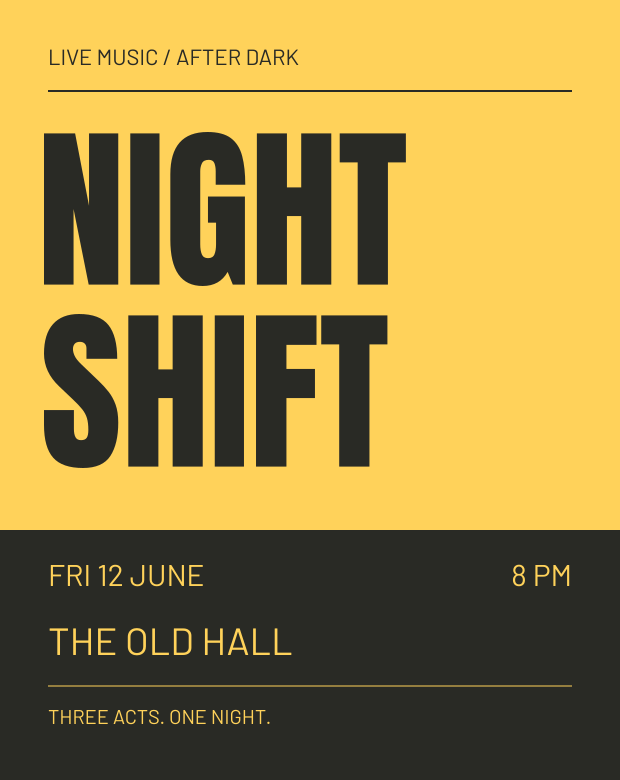
Anton makes the event name the focal point. Its compact capitals leave a clear band below for the practical details.
Barlow Regular carries the date, time and venue in lighter letters. The size change and dark footer separate that information from the headline.
For a longer event name, try Bebas Neue or Barlow Condensed before shrinking everything.
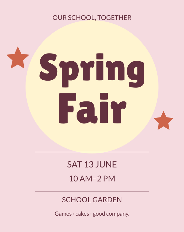
Lilita One gives the mixed-case title a soft, lively shape. Two short lines leave room for the round motif without crowding the wording.
Lato Regular keeps the date and venue calm and distinct. The activity line stays smaller, so the title and time take priority.
If you need more words, remove a decorative element before reducing the size of the event details.
The links open a heading-font sample in the text generator. Create your text graphics there, then arrange them with the other details in your own poster layout.
Selection notes
This is an editorial shortlist for poster headings. We chose eight Regular styles available in the generator to offer different widths, stroke weights and moods.
We compared the same words at the same type size and inspected the illustrated layouts on screen. The recommendations reflect visual judgment; reading speed, distance readability and physical prints have not been tested.
The equal-size specimens help compare letterforms. The complete layouts deliberately vary the sizes to demonstrate hierarchy. Font source links lead to the original family information.
Before you print
Make the event or main message the first thing someone sees. Keep dates, venue and other details in a simpler supporting font, and leave clear space around the title.
Try your actual words before deciding: a narrow font can help a longer title, while a heavy face can give a short one more presence. Check your design at its intended print size and viewing distance.
Compare fonts with your own wordsNeed help placing the result? Read the text graphics guide. Font sources and original notices are collected under Fonts & licences.
Was this guide useful?