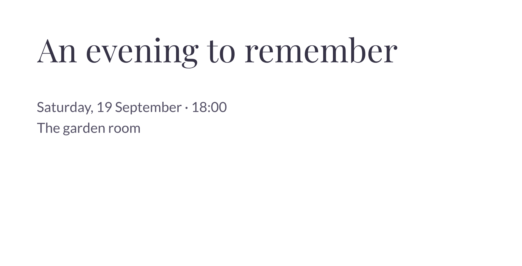
Three ways to support a display title
Playfair Display + Lato: start here for an invitation. Keep the title large and let Lato carry the date, venue and a short description. Try left alignment when the practical details need to be scanned quickly.
Playfair Display + Poppins: try this for a short announcement. The geometric body lettering changes the mood of the composition. Use a brief supporting sentence and check that the body text does not compete with the title.
Playfair Display + Barlow: test an editorial card or event introduction. Add two or three lines of supporting text and adjust line height until they feel comfortable together. These combinations are editorial starting points, not a ranking of readability.
The presets use locally hosted Regular faces, including a static Playfair Display release. The live Google Fonts preview may use a newer release. Heading size, body size, spacing and color remain editable. SVG and PDF exports contain outlines; they do not install fonts or keep the words editable.
Font design sources: Playfair Display